Telecommunications Company User Testing Project
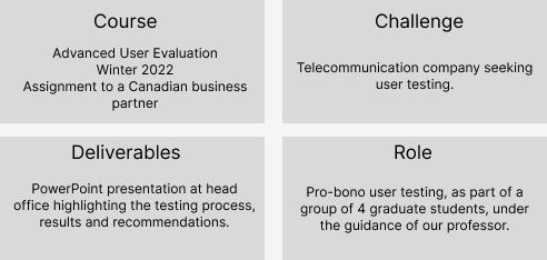
Course: Advanced User Evaluation, Winter 2022. Assignment to a Canadian business partner who will remain anonymous. This case study will be partial due to this.
Challenge: Telecommunication company seeking user testing.
Deliverables: PowerPoint presentation with the testing process, highlights, results and recommendations.
Role: Pro-bono user testing, as part of a group of 4 graduate students, under the guidance of our professor.
The Mandate
When speaking to the partner, they had one big question in mind:
Were consumers learning enough about the company's features?
They worked hard to build a business model that would benefit users. Was their branding taking away from the central purpose of learning about the company's offers? The company didn't want their design to be bland. They wanted fun, but not at the expense of the user not understanding what they offer. Based on this information, we moved to the next point...
Research Questions, Hypotheses & Versions
Version A of the website: a descriptive tone with little branding and simple design;
Version B of the website: a branding version, featuring an elaborate design and branding (current version).
Our team quickly went to the drawing board and established our research questions and hypotheses. Based on the more simple and descriptive tone, we anticipated version B would lead to a higher understanding of the company offers. Due to the aesthetics, we expected version A to be favoured in terms of general satisfaction.
RQ1: Which version of the webpage allows for a better understanding of xyz's services? (learnability)
RQ2: Which version of the webpage generates more satisfaction in users?
RQ3: How effective are users in locating a webpage in the current xyz website menu?
H1: Version B of the experience will provide a better understanding of the services.
H2: Version A of the experience will generate a higher satisfaction.
Methodology
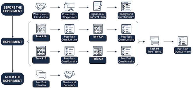
Our test featured a between-subjects design with counterbalancing. There were 13 participants.
Task 1: The first task involved the user freely browsing the webpage on one of the company's services or features and stopping once they feel they have learned enough. Did they learn about the features, or were just focused on the branding's wow factor?
Task 2: We then tested their newfound knowledge by providing a quiz assessing the information on that particular page.
Task 3: Finally, the third task entailed a tree test, in which the users tested the webpage's information architecture.
Qualtrics
We used Qualtrics for all our questionnaires, as well as the Quiz.
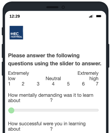
To test learnability, we used quiz scores (understanding of services), cognitive load questions from the NASA-TLX (mental demand, performance and effort) and ease of understanding questions of WebQual (effort in understanding content).
To test satisfaction, we used the customer satisfaction (CSAT) (overall satisfaction with the website) and the Visual appeal subsection of the WebQual questionnaire (satisfaction with webpage design).
Finally, to test effectiveness, we used the Intuitive operations subsection of the WebQual questionnaire (effort in finding content on website), as well as the Tree testing questionnaire from Nielsen Norman Group (findability of website content).
Tree Test
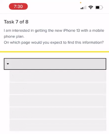
We used Optimal Workshop for our tree test in order to test the company's site menu. It consisted of 8 realistic scenarios that all of us face when switching telecom companies. Users were asked to locate where they think they would find the information that they needed.
Results & Recommendations
Based on the results, we offered tangible recommendations in order to improve company XYZ's services, in order of severity. Unfortunately, all but the result below offered strong hints to the company's identification, so we will omit them in order to retain the company's anonymity.
Here is an example from content on a results slide:
One strength of the current version of the company's website was that users are confident moving through the menu and didn't experience general pain points.
Most users were able to find the relevant page in the menu in two clicks or less (68% Direct Success Rate).
A majority of users found the menu intuitive (5/7 score in WebQual Intuitive Operations).
3/13 Participants cited the easy navigation as being one of their favored aspects of the website experience.
P13: "Everything was in the drop-down menu. It takes two seconds to find what you want."
P03: "The categories of the drop-down menu are clear and direct."
Afterthoughts
This project was a huge undertaking in the span of 4 weeks, but the amount that we learned in such a short time is priceless. Creating a user test from the bottom up was truly enriching and practicing typing our protocols to standardize user testing was also helpful.