Online storage unit usability test
Introduction
Project: I worked in a small team as part of digital entrepreneurship program funded by Québecor's venture capital firm, AsterX, where small-to-medium companies who seek help with their digital strategy applied to receive free support to test and improve their user experience.
Context: This case study focuses on a company whose website assists users with searching and booking storage units. Based on a person’s individual storage needs, they can seek out a specific storage unit, compare costs and offerings of different companies in one site.
Deliverables: PowerPoint presentation with the testing process, highlights, results and recommendations.
Role: Junior UX Consultant, as part of a group of 2 graduate students and 1 senior UX Researcher.
The Problem
The company had some customer complaints expressing that they had booked the wrong size storage unit and wanted to understand more about why and how this was happening.
We identified the research questions as such:
- How often are users successfully or unsuccessfully booking the storage unit they want? Why?
- Which elements and features (filters, surface area search tool) on the website help or hinder users in reaching their goals of successfully booking a storage unit of their choice?
Objective: Understand and evaluate the experience of the booking of a storage unit on the live version of the company website.
Methodology
Our test featured a within-subjects design with counterbalancing. There were 31 participants.
We observed users’ success paths in booking the appropriate surface area for their storage locker based off a fictional but realistic scenario (so that it could be standardized).
Psychophysiological measures: Eye tracking, scanpaths.
Attitudinal measures: Questionnaires (level of trust, effort, usability, satisfaction, intention to revisit).
Behavioral measures: Frequency of use of filters and storage capacity tool – filter pre-set for area & Task success rate.
Results & Recommendations
Analysis & Results: After the user tests were performed and analyzed, it was discovered that 38% of participants were not able to complete the task (selected a storage capacity that was lower than what they needed). There were even more participants who booked a capacity larger than needed, therefore spending more than they need. Worse even, was that roughly half the users rated their confidence in their choice as high, so they did not realize something was off. They were confident in their choice without realizing what they had booked.
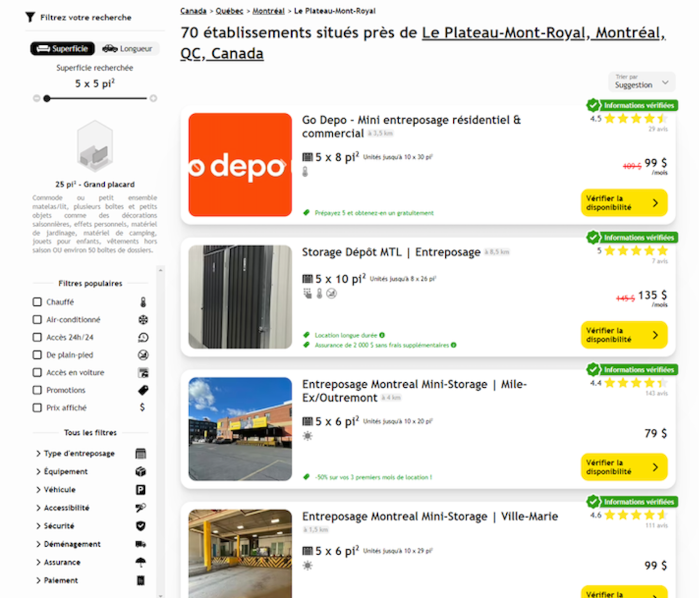
The website allowed users to complete their search without using the tool and there was no clear indicator that they had selected the appropriate surface area. There was also no confirmation on the website when they had successfully chosen their desired unit. What was discovered was the surface area search tool, to the left of the page, was not used by most who failed the task. Most of the users who failed the task did not gaze at the tool once, as shown by eye tracking measurements. Most users who successfully booked the storage size they needed used the surface area tool.
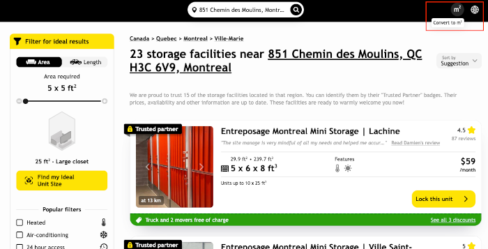
Another issue that unexpectedly appeared was that some of the participants were European and used to measurements in square meters. It was noticed that these users in particular would either take longer to calculate the surface area, or would use an online converter to understand the dimensions.
Impact
We provided results and recommendations based on our findings via a presentation and some were subsequently actioned. The presentation parked a discussion with and among the team.
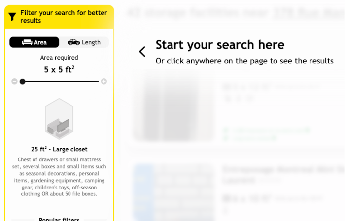
As an example, one of the recommendations provided was to encourage the use of the area filter pre-set quickly upon arrival on the site. They later decided to add an overlay element which drew the eye to the surface area tool. It obscured search results and overlayed guiding element (e.g. “Start your search here”). They also changed the border color to yellow to draw the users’ eye.
Another recommendation was to add a converter from sq feet to sq m to the website as an option to international customers, which they did (imperial to metric).
Top